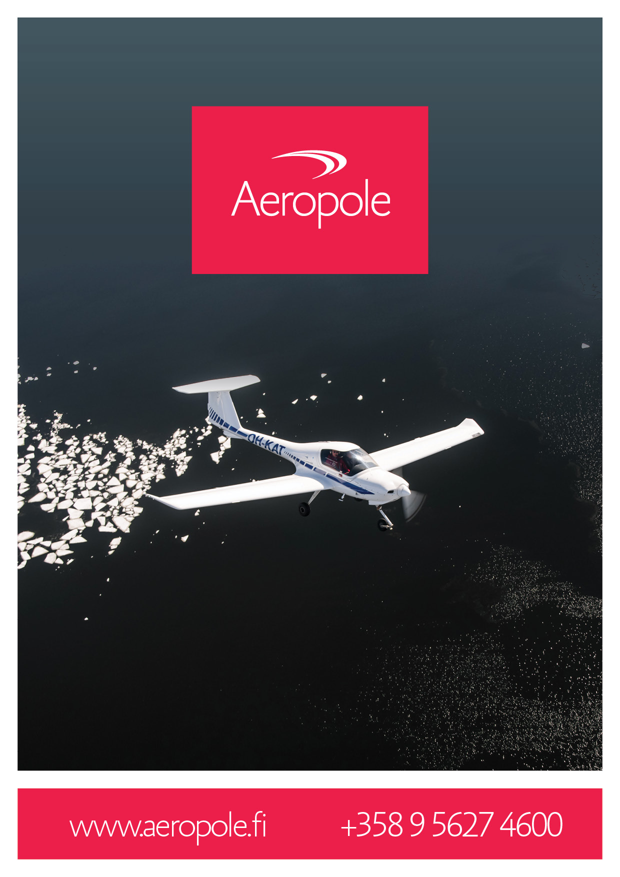
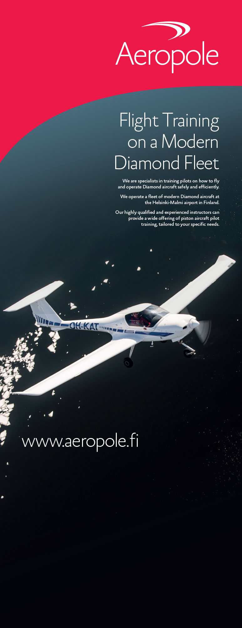
For this professional flight training company I designed the visual identity from scratch. The logo was designed to incorporate both credibility and thrill, hence drawing from sportswear design language combined to aerodynamics and hot red colour.
A brochure for the airline transport pilot course